Somehow I missed this 2014 Fast Company article about how Finland’s most well known icon, a crowned lion brandishing a sword, was co-opted by an extreme right-wing white nationalist group, despite me being both a Fast Company subscriber, and a dual American-Finnish citizen.
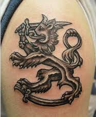
I only learned of this because I was exploring Finnish iconography for possible tattoo inspiration, like this, and one of my relatives cautioned me that the lion had become synonymous with a small, but vocal white supremacist movement in Finland. Obviously if a company or individual usurped a corporation’s brand identity for nefarious or unauthorized purposes, legal remedies would be in order. But this isn’t that kind of situation.
A little historical background
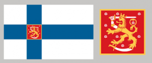
The crowned lion originally was featured as part of a coat of arms on a monument dating back to 1580 and later was adopted by the newly independent Finland as its national arms in 1917. The image is included in some versions of the Finnish flag.
In 2014, because of skinheads brandishing the lion as a sign of white nationalist pride, Finnish ad agency Bob The Robot decided the country needed to, according to the article, “start from scratch with a new symbol.” That was mistake number one.
The agency, in a move reminiscent of many corporate moves, determined it was too close to the subject and that the strategic thinking and new brand identity pursuit should be outsourced to an “objective” third party. Mistake number two.
To add insult to injury, Bob the Robot approached an agency in Sweden. Mistake number three. The Finns often joke they do not consider themselves in competition with others across the globe, as long as they beat the Swedes.
Swedish designer Henrik Nygren went to work, and in December 2014 introduced a new brand design system he offered to anyone wanting to use it. He introduced three design elements, a vertical line and horizontal line from the cross in the Finnish flag and a heart, all in the Finnish blue. He proposed that these items could be used as standalone icons, or in harmony. Below are three examples. You can find more here.
 Why this approach is flawed
1. Cutting and running from the icon firmly rooted in Finland’s independence from Russia, and that reflects the “sisu” (Finnish word encompassing fortitude, grit, force of will, etc.) of the Finnish people would be a travesty. The Finns have a hundred years of equity in the crowned lion and to let it go that easily would be an affront to the  Finnish spirit and culture.
2. Instead of releasing claim to the country’s beloved icon (what my friend and branding guru Laura Ries would call a “visual hammer”), Finland should instead work to reinforce what the crowned lion represents – a shared, inclusive, welcoming national pride, in opposition to the discrimination and hatred spewed by white supremacists.
3. The newly proposed identity is disjointed  in its various pieces, which have no strength as standalone elements, and don’t build on each other when used together, because they never come together. To break up the Nordic cross is to take away the power of the Finnish flag and what a 19th century poet described as the “blue of our lakes and white snow of our winters.” The heart looks like a kitschy selection from the social media playbook, similar to Twitter or Facebook Likes.
Finland doesn’t need a new brand identity
Finland needs to reclaim its brand identity instead of deconstruct the flag and dilute its meaning. The Finns are known for they shyness, humility, and deference, but they are also a quietly proud people. Brand management is not a passive game and it’s time for the country to approach this situation like they approach their hockey.
To me, this is not a design challenge. Rather, it should be viewed from the lens of a campaign challenge to contextualize and communicate the true meaning of Finland’s defining icon, and that does not require an entirely new design. In fact, it would require much less work than introducing and trying to move Finns to a new look and feel.
By maintaining the same icon, and simply adding an accompanying slogan or rally cry to design treatments, the campaign could achieve the same desired end: to preserve a mainstay of its heritage and infuse new energy and enthusiasm for a legacy look, while using that reframing to make the icon unpopular with the extremist opponent groups so they give up using it.
How would that look in practice?
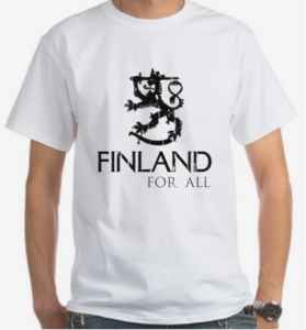
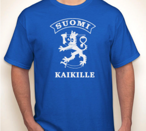
The following is not meant as a fully thought through concept, just a sample execution of how something like what I proposed would unfold in practice – with both English and Finnish treatments. The following are shirts offered on the CafePress website, which I modified for this blog post’s purposes, with two words added to the English version and one to the Finnish one (the exact versions below are not for sale and are only to showcase my point).
In branding, if you want to create a distinctive positioning, sometimes the best approach is to take the direct opposite approach of your competitor. In this case, the white supremacist groups are clearly about exclusivity and discrimination, so the opposite looks like a pretty attractive option. The Finnish ethos is predicated on equity, or in many cases, equality, and collaboration. They take great pride in the country as a collective, with less focus on the individual. So that’s the direction I went with the following.
“Finland For All”
And in Finnish: “Suomi Kaikille”
Pronounced: soo-ah-mee kai-kee-leh
“Suomi” is the Finnish word for “Finland.”
I could envision the creation of a series, possibly several versions on a theme – like “Finland United” or “One Finland” or “Finland Together” – to allow for the most flexibility and inclusiveness among those wanting to express different, but related themes that embrace tolerance, openness, kindness, understanding, inclusiveness, and other similar characteristics I have witnessed among the Finnish people.
This type of campaign also unfold through public relations campaigns and could be easily produced on buttons or lapel pins for politicians and business leaders, badges or insignias on sports jerseys, signs, billboards, and public service ads. It could be the basis for community-based events across the country, education programs within schools, and on and on.
Yes, what I’m proposing is just a slight departure from current approaches. But sometimes the best way to solve a big problem is not with a big completely new idea. Sometimes, by simply shifting how you look at a big problem, you can get bigger results with smaller actions, without creating new, bigger problems.
In ditching its history, its legacy, its culture, and its iconography, Finland would be creating a bigger problem. Instead, the Finns should double-down, embrace its sense of self, and reclaim the identity that is rightfully theirs.
And they don’t need Sweden for that. And maybe then I will get my tattoo.
Do you agree? Disagree?
I’d love to hear from you. Make your case for when and why you think a brand should ditch its brand identity if someone co-opts it.


